How to Visualize NetSuite Dashboards with Google Charts
Whether you’re in finance, accounting, sales, marketing or operations, if you want to have a positive impact on your business, you need to make accurate decisions. And that means visibility into your business – visibility NetSuite analytics dashboards can provide.
LinkedIn CEO, Jeff Weiner, has said that data “powers everything that we do.” Weiner’s statements are not ground-breaking, but they are true. Any successful entrepreneur will tell you that data (otherwise known as metrics, numbers, percentages, KPIs, etc.) plays a huge part in companies’ successes.
Request More Info About Custom NetSuite Dashboards for Better Analytics
Data gives business owners and their employees the information required to properly manage project completion as well as product development and deployment. Data also provides clients with the facts necessary to make appropriate decisions when choosing products and services.
But, in order to be effective, data must be adequately communicated and presented. The question is: how can businesses successfully convey/share the numbers that matter most? For those doing business in the cloud, NetSuite dashboards provides the best answer.
To maximize profits and operations, your organization needs clear visibility into team and project performance. The NetSuite Dashboard is a data-focused cloud business solution that gives real-time visibility into project performance.
This system simplifies the organization and management of company data by giving stakeholders access to personalized graphs in order to ease the monitoring and analysis of company numbers. With NetSuite dashboards, employees can drive project performance, ensure profitability and proper resource utilization, and improve overall collaboration.
This is the perfect ERP tool to monitor, report and analyze overall project performance in real time, including resource utilization, profit margins, project budgets versus actual and more. For growing companies in need of an all-encompassing system, it’s the perfect tool to provide metrics for employees and clients.
For larger businesses, advanced NetSuite dashboards powered by Google Charts provide interactive and dynamic visualization tools. From bar graphs and pie charts to animated motion charts and org maps, these integrations turn static data into actionable insights, perfect for executives, managers, and project teams.
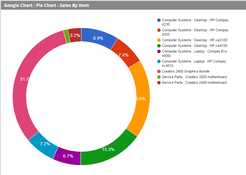
Diagram 1
This simple Pie Chart is an example of being able to visualize sales by item over a period of time.
Additionally, because NetSuite and Google Charts are cloud-based programs, they enable data to be accessible at any time and at any place, safeguarding clients and employees’ ability to always make smart data-driven decisions. You’ll be on your way to seeing your business results more clearly by displaying data in the form of bar charts, gauges, grids and advanced KPI graphics.
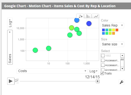
Diagram 2
This much more complex Motion Chart shows sales amount per item and per sales rep. Position on the chart also reflects gross profit while the “play” button at the bottom allows users to view a play-through of this data over time to be able to visualize evolving trends.
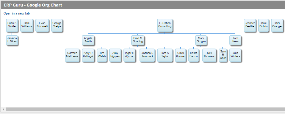
Diagram 3
This chart will extract the Org Chart of your organization and display it.
A NetSuite expert can effectively implement Google Charts for NetSuite. Once set up, every stakeholder from executive to project manager can instantly see personalized reports with the metrics that matter most.
Learn More About Custom NetSuite Dashboards for Better Analytics